How to Create Toggle-Able Menus in CSS
A short walkthrough on how one can create toggle-able menus in pure css or tailwind, without JS.
tl;dr
Use
<input type='checkbox'>+ thepeerandpeer-checked:tailwind utility classes. Regular CSS examples below.
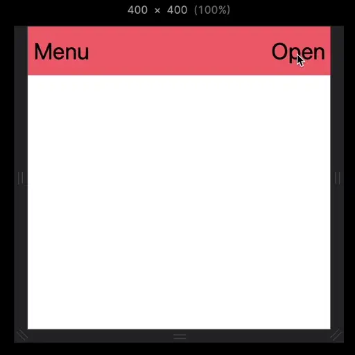
°l||l°l||l°l||l°l||l°l||l°l||l°l||l°l||l°l||l°l||l° Tailwind CSS is fantastic and will probably continue to become more and more popular than it already is. Nonetheless, there's a lot of HTML/CSS help on the internet out there, and hardly any of it is Tailwind specific. So, here's how you can easily create toggle-able/collapsable menus using just tailwind. We'll just use a basic example, but the ideas are universal and very easy to apply to virtually any scenario you'd like to use. We start by creating our html the way that it will look in it's toggled (i.e. open) state. In this example, I'm going to create a So, because I want to toggle my menu and I'm using a nav element, I will make my menu a child of (Note: above ☝️ is the title of a 'tabbed' window, and what follows is each 'tab' presented within that window. You may click here if you wish to leave 'reader' mode and go directly to the rendered version of the window and its tabs.) (🗂️ End of "Step 1. Menu Layout" 🗂️) Here's the example above in the tailwind playground. (Note: there's some additional styling here just to make everything be a little more realistic. Mainly the height, padding, items alignments, and text size.) Now that our layout is in place, we need a way to control it. To do that we're going to need make use of an Now, we're going to use As you can see in the example below, we're hiding both the "Close" labels and our menu by default, but displaying both when the "Open" label is tapped. Note: We can hide the actual (Note: above ☝️ is the title of a 'tabbed' window, and what follows is each 'tab' presented within that window. You may click here if you wish to leave 'reader' mode and go directly to the rendered version of the window and its tabs.) (🗂️ End of "Step 2. Add Menu State" 🗂️) Here's the example above in the tailwind playground. As you can see we have one label to open the menu, and one to close it. So in summary the "Open" Finally, we want add some animation and the ability to tap outside the the menu to close it, instead of always having to always tap "Close". To do that we're going to add a third label, that acts just like our "Close" label from above, but it will be transparent and take up all remaining space outside of the element. Additionally we have to implement our "off" state differently now. We can't use (Note: above ☝️ is the title of a 'tabbed' window, and what follows is each 'tab' presented within that window. You may click here if you wish to leave 'reader' mode and go directly to the rendered version of the window and its tabs.) (🗂️ End of "Step 3. Animate Open/Close" 🗂️) Here's a link to the final version. Probably the trickiest thing to get here is how the menu is hidden when our toggle is "off". Basically, we have a div that's set to The last thing I need to say about this is there's also the Hope that helps, let me know what you made.Create Your Menu's Layout🔗
nav element, with a flexbox layout to hold everything. You can do this any way you like, but what's important here is that - however you do it - anything we want to toggle must be siblings of each other, i.e. nested the same way in our html.nav, even though it's position is fixed. Also, the menu uses fixed because when it's open I want it to cover the content.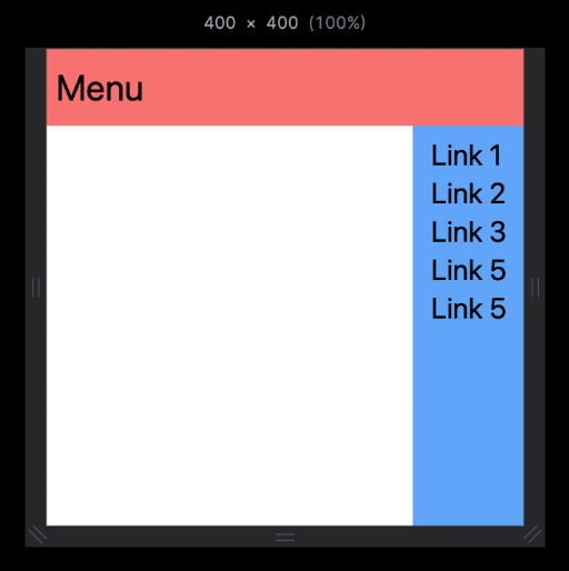
Add a Checkbox + Labels as a Siblings to Your Menu🔗
<input type='checkbox'> and two tailwind utilities: peer and peer-checked:. As alluded to before, the <input> element is going to be a sibling to what we want to control. This is necessary when using peer + peer-checked:.peer on our <input>, which designates it as the thing that will do the controlling. Then, we give peer-checked: to whatever we want to control. We also want our menu to be hidden until a user taps "Open", so we need a default "off" state. For that we'll use hidden for now.<input> element and use <label> to toggle its state.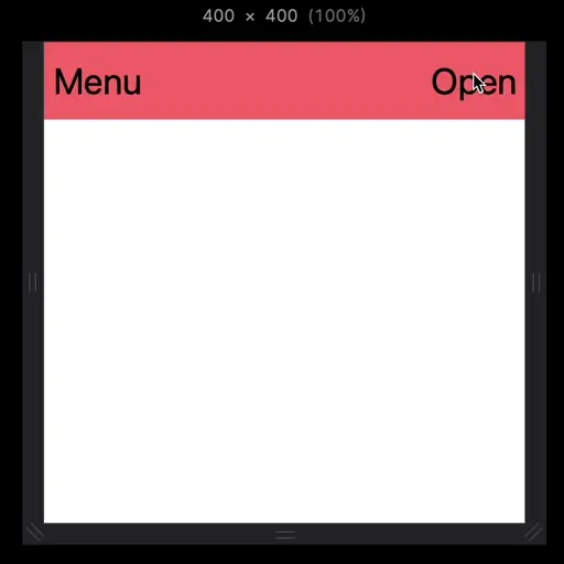
<label> is shown by default, and it gets toggled off/on when tapped, whereas the "Close" <label> and our menu, i.e. <div id="menu"> are the reverse and get toggled on/off. The <input> itself is hidden all the time, we don't need to show it to make use of it.Add Animation (Optional)🔗
peer-checked:block to hide the menu and use animations, since CSS doesn't support animating transitions of the display property. To do this, we're just going to set the off state to literally off the screen, and then our on state will bring it back. So let's see what the final code looks like.📄 Tab 1: tailwindcss
1 <nav class="flex h-16 items-center bg-red-400 px-2 text-3xl">
2 <span>Menu</span>
3 <input type="checkbox" class="peer hidden" name="toggle-menu" id="toggle-menu"/>
4 <label class="cursur-pointer ml-auto peer-checked:hidden" for="toggle-menu">Open</label>
5 <label class="ml-auto hidden cursor-pointer peer-checked:inline" for="toggle-menu">Close</label>
6 <div id="menu" class="fixed -right-full top-16 flex h-screen
7 w-full transform-gpu transition-transform duration-200
8 ease-in-out peer-checked:-translate-x-full">
9 <label class="ml-auto flex-grow" for="toggle-menu"></label>
10 <ul class="h-screen bg-blue-400 px-4 py-2 text-2xl">
11 <li>Link 1</li>
12 <li>Link 2</li>
13 <li>Link 3</li>
14 <li>Link 4</li>
15 <li>Link 5</li>
16 </ul>
17 </div>
18 </nav>
📄 Tab 2: HTML + CSS
1 <style>
2 .peer:checked ~ .peer-checked\:block {
3 display: block;
4 }
5 .peer:checked ~ .peer-checked\:inline {
6 display: inline;
7 }
8 .peer:checked ~ .peer-checked\:hidden {
9 display: none;
10 }
11 </style>
12
13 <nav style="display: flex; height: 4rem; align-items: center; background-color: rgb(248, 113, 113); padding-left: 0.5rem; padding-right: 0.5rem; font-size: 1.875rem; line-height: 2.25rem;">
14 <span>Menu</span>
15 <input type="checkbox" name="toggle-menu" id="toggle-menu" style="display: none;">
16 <label for="toggle-menu" style="margin-left: auto; display: none;">Open</label>
17 <label for="toggle-menu" style="margin-left: auto; display: inline; cursor: pointer;">Close</label>
18 <div id="menu" style="position: fixed; right: -100%; top: 4rem; display: flex; height: 100vh; width: 100%; transform: translate(-100%) rotate(0deg) skewX(0deg) skewY(0deg) scaleX(1) scaleY(1); transition-property: transform; transition-timing-function: cubic-bezier(0.4, 0, 0.2, 1); transition-duration: 200ms;">
19 <label for="toggle-menu" style="margin-left: auto; flex-grow: 1;"></label>
20 <ul style="height: 100vh; background-color: rgb(96, 165, 250); padding: 0.5rem 1rem; font-size: 1.5rem; line-height: 2rem;">
21 <li>Link 1</li>
22 <li>Link 2</li>
23 <li>Link 3</li>
24 <li>Link 4</li>
25 <li>Link 5</li>
26 </ul>
27 </div>
28 </nav>
w-full and its display is set to flex. We then put that entire thing off screen with fixed top-16 -right-full. When its peer gets checked, we perform a CSS translate animation using Tailwind, i.e. peer-checked:-translate-x-full, and then the rest of the class info is just stuff to make it look nicer, i.e. transform-gpu transition-transform duration-200 ease-in-out.<label> next to the <ul>. That's our new, third <label> which we use to implement clicking outside of the menu to close it. As you can see it has a tailwind class of flex-grow which instructs it to basically take up any available space. So, the browser is going to first allocate space to the menu, because of the menu's content. After that it'll go to whomever is using flex-grow.
°l||l°l||l°l||l°l||l°l||l°l||l°l||l°l||l°l||l°l||l°
click for comments